Color palettes
When I was working at Illumina one of my projects was to create a visualization for the results of the whole genome sequencing pipeline. I took my figure to one of my coworkers to ask him what he thought. His response was that he thought that the structure was nice, but he couldn’t distinguish between some of the colors because he was colorblind. He shared this article with me, and that was my first real introduction into using different color palettes for figures.
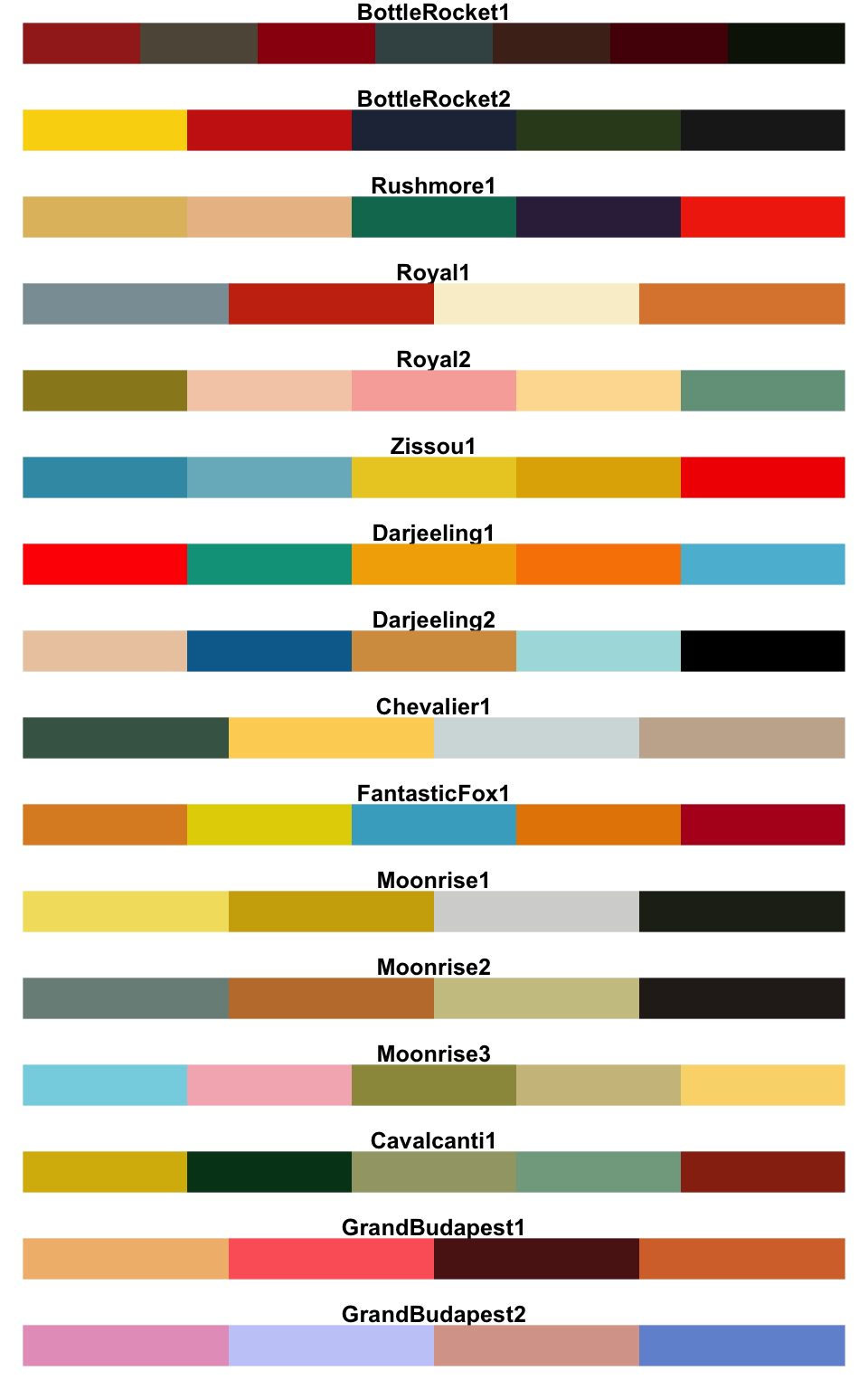
Recently, someone else shared this library of Wes Anderson themed palettes with me. The palettes are mostly derived from this blog It seems like a fun way to make your color choices, although I haven’t tried it out on any of my plots yet. Here are the palettes available (image taken from this blog post)
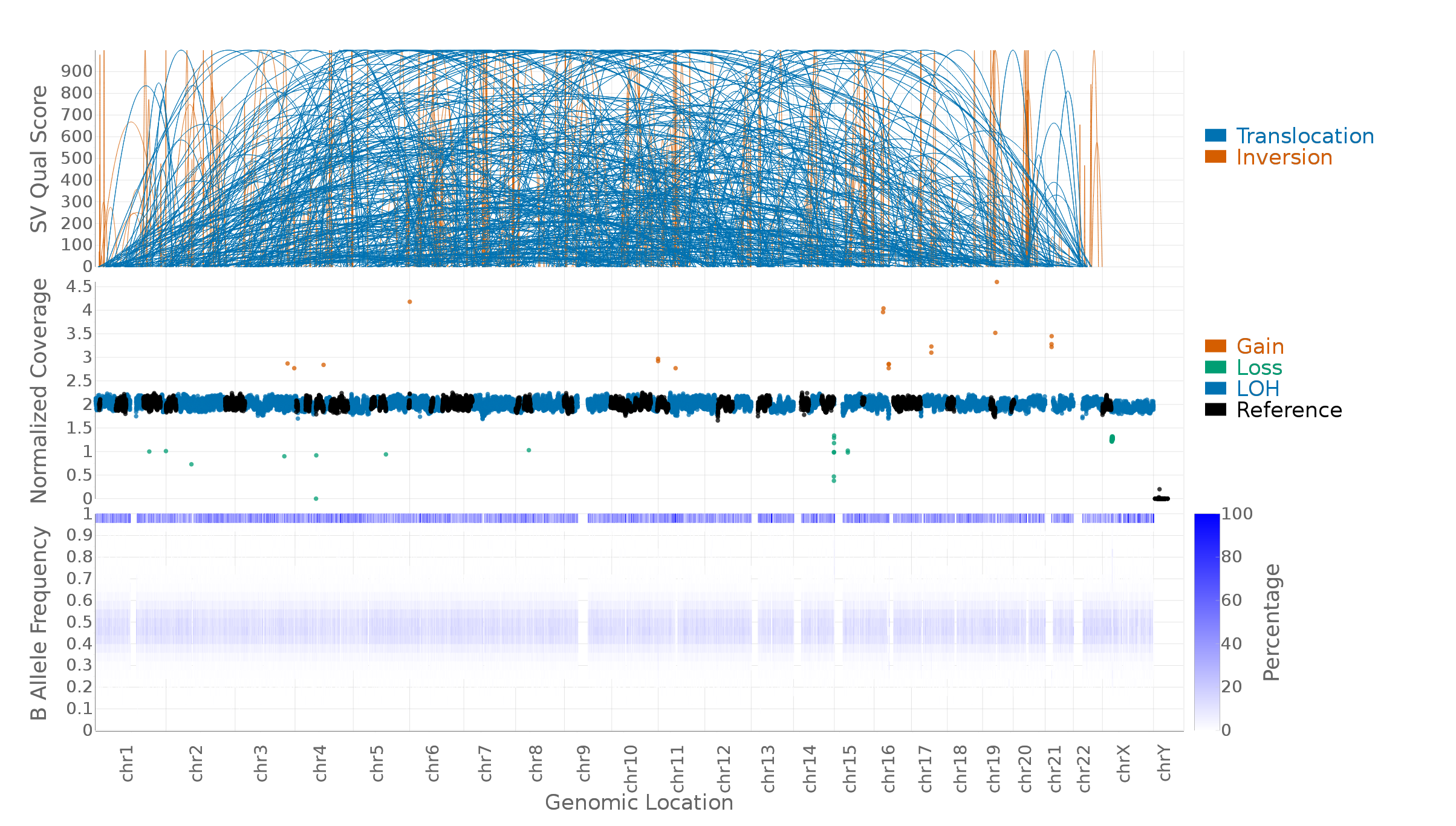
In case you’re interested, here’s an example of the plot I created at Illumina. The top plot shows all of the structural variants that were called by plotting a parabola from startpoint to endpoint with the height representing the confidence of the call (it’s very messy because this particular cancer sample has a lot of structural variants). The bottom two figures are both coverage plots and the middle plot is color-coded by copy number variation calls of various types. I made the plot using D3.